
Friday, 15 April 2011


Audience feedback for my music magazine!
Revolution Music magazine evaluation:
1) Overall what would you rate my the magazine on a scale of 1-10?
2) Why?
3) What music genre would you say this magazine represents?
4) Why?
5) Does this magazine engage you?
6) What would you say the strengths of this magazine are?
7) What would you say the weakness of this magazine are?
8) How much do you think this magazine should be?
9) Would you buy this magazine if it was in the shops?
10) What magazine would you say this is similar to?
11) Any other comments or feedback you would give?
Audience fedback, photogrpah questionaire.
Audience feedback
Photographs-
- Do you think that the photo’s in the music magazine are to a professional standard?
- Would you change any of the photos included?
- Which one?
- Is the style of the photo’s in keeping with the genre of the magazine?
- Why is this?
Wednesday, 13 April 2011
More photos
After recieiving feedback I was told I needed to incude more photos in my contents and have a wider range of photos of my solo artist in my double page spread to add to the professional quality of the magazine, here are the photo's I took...

Because focus is not clear in this photo I do not think it is suitable the lighting is also to dark.

I believe this photo looks to serious for the idea behind the image I wanted to portray was young new girl band.

Not flattering for everyone

I decided on this image for my contents page, as I think the lighting is correct and the group looks as one
as well as illustrating the young, fresh, fun ideology of the magazine I wanted to portray.
As well as this it is a conventional photo in the fact the pointing bring in our audience.

This photo the lighting isn't correct.

Mid pose, would therefore make the magazine look un-professional.

I like this photo however the eyes closed does not attract the audience in.

The two pairs are to seperate not making them look like a whole group.

They look bored, not suiting my ideology as well as the lighting being incorrect.

I like this photo however do not believe it is the best, and is slightly more controversial.


This photo looks more like an awkward style not looking natural enough for the double page spread to be used.
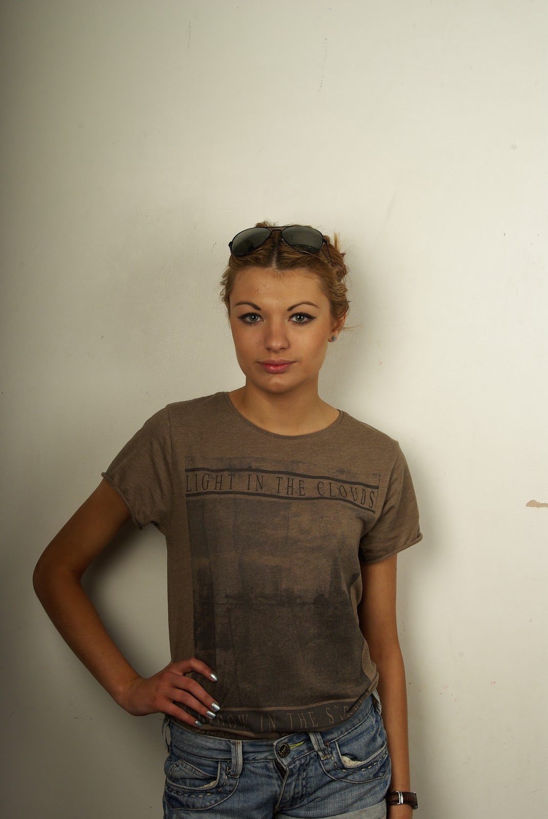
I have used this photo in my double page spread, as I believe the slight smile creates the feel I wanted for this artist, and it is a flattering shot. The hand on the hip also gives it that edge that is associated with indie music.

I like this photo however think her back is to much to the audience and does not invite people in as much as other shots.

This photo is not central enough to be used, as well as the lighting being to bright. It would not be conventional.

I decided to use this photo in my double page spread as it focses mostly on her fac ebeing conventional of a music magazine, the slightly open mouth also sends out innocence and invites in the audience as she looks comfertable and easy.

I have decided not to use this photo as my artist looks bored and uncomfertable which would not invite my audience in.
Tuesday, 12 April 2011
Price
When thinking of the price of this magazine I looked at magzines with a simmilar music genre and their quality, then looked at the price, I decided that judging by the amount of pages in the magazine and the style of it, that £2:00 was around the average price, when asking people in a survey what price they would buy this magazine at, the answers ranged from £1:50 to £3:50 so I believe that £2:00 is the correct average price.
Subscribe to:
Posts (Atom)