Evaluation.
For my AS Media Foundation Portfolio I was set the brief of creating a music magazine; front page, double page spread and contents page. Picking a certain genre and making it the theme of the magazine using all original texts and images.
I presented my work, planning and research on a blog format using www.blogger.com.
I chose the genre indie/rock tailoring my codes and conventions to magazines with either the similar or same genre, for example NME. I tried to make my magazine conventional, not challenging the conventions or making my own.
My front cover included many of the conventions, such as a bar code, puffs, tag line and issue number all in the conventional places you would find them on most music magazines for example my music magazines web page and price was up by the masthead. I know from audience feedback on the look of my magazine that it looks similar to other magazines and that it has a professional quality to it, something I believe conventions add.
I also decided to go with a conventional look for my double page spread, however not using as many conventions as in my front cover not having things such as pull quotes, this was due to how I decided I wanted the magazine to look and the content I wanted in it, some audience feedback has stated that they believe that pull quotes would of looked good, however when looking at percentages of for and against pull quotes, more people have said that the double page spread did not need it.
Continuity of the two pages when looking back was something I found quite difficult as I blocked the page in two, as well as this the photo I wished to use did not have a strong background so I took the background out meaning the image was just of the artist, so did not join the two pages together.
After feedback I realised how to change my double page spread to have more continuity, including more images at the bottom of the page spreading across and moving coloured boxes to not split at the half way page point. Over all I am now happy with my double page spread and find that sticking to the conventions and not being unconventional suits the style of my magazine as the idea I was trying to portray is that indie music is becoming more and more mainstream.
The contents page of my magazine follows a similar style to NME, after researching many magazines contents pages I decided on this specific style as it was the most similar to the genre and ideology I was trying to achieve. I believe I have succeeded in creating a style similar to NME in my contents page as in audience feedback when I have asked “What music magazine would you say this is similar to” most have answered NME.

I included conventional colours in my contents page also using red’s and blacks making sure that when the audience looked at it they made an immediate reference to it being a music magazine. This was also to create continuity throughout the magazine as I used them in my front cover and double page spread.
My music magazine represent people of social class E and D as it is targeted at a younger student audience. Using headlines and images which will appeal to them, fonts are also key using sans serif fonts and blocked text as they are usually associated with a younger audience, serif being more higher class and older. I had mind my target audience and looked at NME reader profiles to achieve a magazine which targeted the correct audience and had a clear demographic. I know that I have achieved the right target audience through audience feedback asking a range of people whether they would buy it or not, people that fitted into my target audience saying yes and people who did not being slightly older or having a higher social class saying no, giving reasons such as it looks to young etc.
After coming to the conclusion of my target audience I had to make a price for this magazine that would be suitably affordable as well as being the correct pricing for a magazine with 37 pages in.
When thinking of the price of this magazine I looked at magazines with a similar music genre and their quality, then looked at the price, I decided that £2:00 was around the average price and was affordable for students, when asking people in a survey what price they would buy this magazine at, the answers ranged from £1:50 to £3:50 so I believe that £2:00 is the correct average price.
The colour scheme I have used was something I put a lot of focus into, creating mood boards and looking into my genre and the colours artists use in their albums and promotions, as well as looking at magazines with a similar genre and target audience, after deciding on my colour scheme and putting them into my magazine, I asked 9 males and 9 females if they like the colour scheme here is the feedback:

I believe that I got this response as red is one of the more prominent colours, which is usually seen as more female.
From carrying out the preliminary task, I gained experience in how to organise time as well as more experience with Photoshop, this meant I could do things more efficiently when it came to my music magazine. As well as this I learnt what looks good and how to space things, one of the main things I learnt was that it may seem cramped and writing may seem small on the page but when printed of lot more could fit in.
I also from the preliminary task realised how important conventions are to make a magazine look professional, the college magazine having some similar conventions such as a bar code and issue no. etc.
I used a number of programmes and different technologies for my Music magazine, they are all listed below:
Cameras
Photoshop
Blogger
I found Photoshop incredibly useful as it helped to create a quality look, however it took me a while to get used to some of the tools as I did not understand how to use all of them. For example, the different types of crop tools and knowing which one was best to erase different types of things, getting a smooth finish.
Blogger us another technology which has been extremely useful as it meant I have been able to go along and edit things as I go, as well as keeping everything safe.
The fact it can hold multimedia has been very useful meaning I can post pictures on it that I have used or that have given me inspiration as well as videos for artists that I believe my music magazine would include.
I have no complaints about blogger, however think I could have been more organised with updating it.
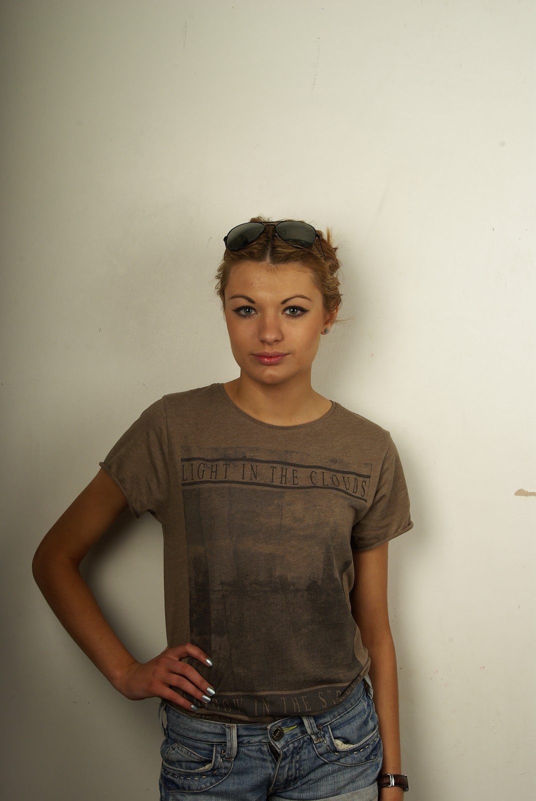
Cameras where a key technology for my music magazine, as I needed my own original images, some of my photographs were shot with standard cameras and did not look as professional and others where shot in a photography studio with lighting and a more professional camera, giving the photos a better look. If I would change anything I would of done more practises with taking photos as I believe it took me a while to create quality photographs. Feedback also confirmed that some of my photos looked more professional than others when I did a questionnaire on the quality of my photos.
Audience feedback has helped me greatly in how to make my magazine look more professional, I found it best to keep making changes, stopping and asking people for feedback so I knew had more direction with changes needed to be made, once I had established a clear target audience I tailored getting audience from people just in my target audience, so that the magazine appealed to them in every way possible.
Over all I think I managed well with the task, however if I were to redo this task I would like to of taken more professional looking photos for my double page spread so that that the background of the photo could be used as the background to the page. I would of took to a more strict plan so that I had enabled myself time to make changes, as I believe my organising was one of the things that let me down most in this project.